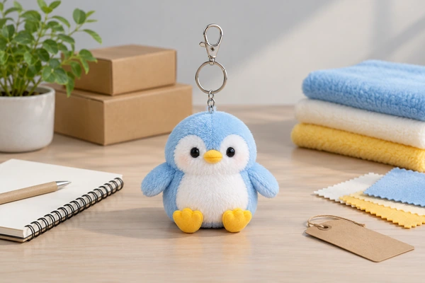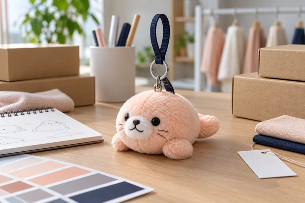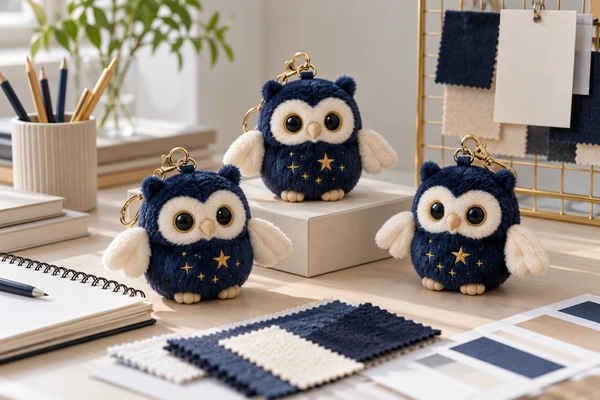

Use embroidery for a visible mark on the charm, a woven label for a compact sewn-in identity, and a hangtag for information shoppers need before buying. These options can work together, but each should have a defined purpose. The best combination depends on the charm’s size, surface, selling format and intended audience.
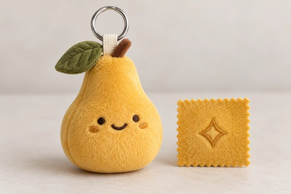
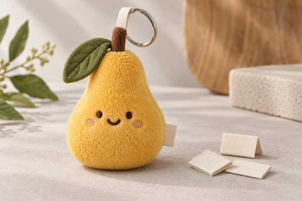
A golden pear concept makes the tradeoffs clear. Its rounded front is valuable character space, its side seam can accommodate a small label, and its ring can carry a retail tag. Start with the complete plush bag charm, not an isolated logo file.
A three-part branding matrix
| Touchpoint | Primary job | Main approval question |
|---|---|---|
| Embroidery | Visible lasting identifier | Is it legible without crowding the character? |
| Woven label | Compact sewn-in brand identity | Does the exposed area remain readable and comfortable? |
| Hangtag | Retail story and product information | Can shoppers read it without hiding the charm? |
Write this allocation into the OEM and ODM brief. Avoid automatically putting the same long brand name on all three surfaces. A small emblem, a concise brand label and a fuller hangtag story may communicate more clearly.
Embroidery: reserve enough usable fabric
Measure the decoration area after allowing for seams, curvature and pile. A pear’s widest flat-looking area may become rounded after stuffing. Request an actual-size sew-out on the proposed fabric, followed by a finished sample. Check tiny counters in letters, spaces between elements and whether the mark competes with the face.
Stitch preparation and backing matter. Madeira’s stabiliser selector shows how material properties influence backing choices. Send editable artwork and a reference image; Adobe’s vector and raster guide explains why these files serve different purposes. Discuss simplification before the embroidery file is finalized.
Woven labels: approve the exposed portion
A label specification needs more than total width and height. State the fold type, insertion allowance, exposed dimensions and seam location. Ask for a photo of the label installed on the charm, because a loose label can look readable while its sewn version loses part of the design inside the seam.
Check the cut edge, fold and contact with the user’s hand or bag. Confirm that the label does not twist over the face or interfere with the attachment loop. Bring those details into the construction review. The Coats soft and secure seams guide offers relevant sewing context, while the actual acceptance criteria should be agreed for your product.
Use physical color approval where appearance is important. Pantone’s physical sample guidance is a useful reference when comparing label yarn, embroidery thread and body fabric. Do not assume three different materials will look identical under every light.
Hangtags: design for the buying moment
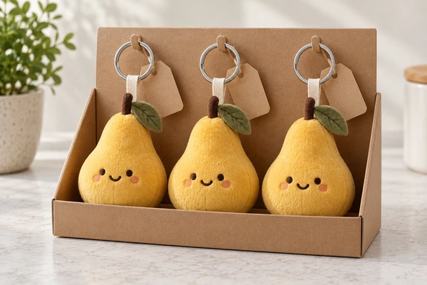
View the tagged charm hanging from a peg and resting in a countertop tray. Check whether the tag faces forward, covers the character or tangles with neighboring rings. Specify the attachment method and ask the supplier to assemble a small display group, not just photograph one item in isolation.
Separate the brand story from operational information. Buyers may need a SKU, barcode, variant name or specific receiving labels. Use the GS1 GTIN Management Standard when defining trade-item identities, and the GS1 measurement standard when documenting packaged dimensions. Confirm the retailer’s own requirements before printing.
Environmental claims need evidence and careful wording. The FTC Green Guides summary is useful for reviewing terms such as recyclable or recycled. A kraft-colored tag is not, by itself, evidence for either claim. Keep approved substantiation with the artwork record.
Approve the complete charm as one product
For a collection with several colors, decide which branding elements remain shared. A common tag layout may simplify replenishment, while a clearly identified variant prevents receiving errors. Ask for a packed assortment photograph showing all colorways and their tags together. Check that a pale label remains readable against a pale body and that a dark embroidered emblem does not disappear on the darkest version. Approve each combination rather than assuming the first color proves every variant.
Branding changes can affect the finished article. Review the intended user and use with the applicable safety requirements; the CPSC toy safety guidance is a starting point for US toy planning. Product classification depends on the actual design and intended use, not the word “charm” alone.
Your quality-control checklist should compare the installed embroidery, label and tag against one approved sample. Record which details are permanent and which are removed before use. Keep a copy of every final print file alongside photographs showing the assembled result.
Read the sourcing FAQ, review the company introduction and submit your charm brief with the target size and display format. Clear information at this stage makes the first sample more useful.
Images are original concept illustrations. Blank labels and tags represent proposed branding areas.
Prepare your decoration approval inquiry
Copy and complete this brief; mark unresolved items to confirm.
Company / contact:
Product / size / intended use:
Market / quantity / arrival date:
Artwork version:
Production materials:
Approval reference:
Email This BriefWhatsApp This Brief
Review and send it yourself, or paste it into our inquiry form.