Matching Pantone colors on custom plush dolls requires a physical approval process. A color code identifies the target, but the finished appearance also depends on fabric, pile, thread, lighting and adjacent colors. Treat artwork approval, material approval and assembled-sample approval as three separate decisions.
For a character designer, a simple decision log prevents “approved coral” from meaning three different things. Add it to your character design brief, naming each body panel, accessory and facial element. The aim is a repeatable character identity, with any accepted compromises recorded before bulk production.
Decision 1: Which physical reference governs?
Send the complete color reference, including its system and suffix, plus a physical swatch when practical. Pantone’s color-system explanation helps distinguish references developed for different applications. A packaging color and a plush fabric color should not silently share one approval just because their digital previews look similar.
If a brand guide specifies a graphics reference, ask the supplier to propose a textile match and identify the proposed material. Pantone explains the practical differences between substrates in its cross-system guidance. Approve the actual fabric, not an undocumented automatic conversion.

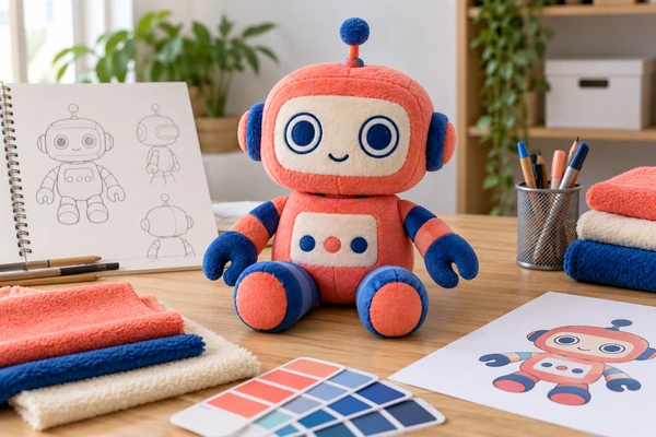
For a hypothetical coral-and-cobalt robot, the coral body might use short pile while the cobalt limbs use a smoother textile. Review both together. Record the supplier’s fabric reference beside each approved swatch, and keep sufficient material for later comparisons. Use our fabric selection questions when weighing hand feel against appearance.
Decision 2: How will reviewers compare colors?
Agree on the primary viewing condition and any secondary retail or use environment. Pantone’s synthetic-textile recommendations address controlled visual and instrumental evaluation. Ask the supplier to document its method rather than approving a fabric from a phone photograph alone.
Check the assembled colors under the agreed secondary lighting too. X-Rite explains metamerism: two materials can match under one light and differ under another. Also brush and orient the pile consistently. X-Rite’s discussion of texture and viewing angle explains why a rotated panel may appear different without a change in dye.
Decision 3: Which details define the character?
Color cannot rescue a face whose eyes sit too far apart. Provide front, side and back references with the important proportions marked. Identify fixed features such as eye spacing, eyebrow angle, mouth curve and emblem location. For each, state whether the artwork is an exact production target or a visual starting point.
Separate editable source artwork from viewing PDFs. Adobe’s raster and vector overview helps explain why a small screenshot is an incomplete production source. Include original assets and clearly named exports, then discuss the changes needed to turn flat artwork into plush.

Evaluate facial decoration at finished size. Small thread areas, pile coverage and curved seams can change a line’s apparent weight. Compare embroidery and printing using actual samples, and document the selected method. A photograph is useful for locating a correction, but should not become the only retained color standard.
Keep an approval log with decisions, not opinions
| Entry | Example information to record |
|---|---|
| Reference | Body fabric, supplier code and swatch version |
| Observation | Approved under agreed lighting; secondary-light concern noted |
| Correction | Move left eye toward center by the specified amount |
| Authority | Named brand approver and approval date |
| Scope | Color approved; face placement remains pending |
If instrumental tolerances are used, agree on the measurement method and evaluation settings. Datacolor’s measurement guidance provides useful background. Avoid imposing a universal Delta E limit without understanding the material and the supplier’s measurement setup.

Close the gap between approval and production
Use precise feedback when a sample misses the target. “Too dull” leaves the factory guessing whether the issue is hue, saturation, surface sheen or lighting. Instead, identify the affected panel, compare it with the named physical reference, and describe the observed difference. Request one controlled change at a time when several variables could explain the mismatch.
For the robot example, approve the body fabric independently from the eye placement correction. Then review a complete assembled sample after both are resolved. This avoids accepting an attractive loose swatch that looks different once stretched over filling, placed beside contrasting limbs or interrupted by a seam. Record any intentionally accepted difference as a project decision, with an explanation that a future buyer can understand.
Retain signed references on both sides and identify what may change only with written approval. Apply configuration-management principles to the artwork file, swatches and final sample as one controlled set. Keep obsolete versions clearly separated so production cannot accidentally follow an earlier face layout.
When extending the character, revisit consistency across sizes; shrinking a design can require a new face treatment. For repeat orders, follow a retained-reference process and reconfirm material availability. Send your artwork and approval priorities to Shinegifts for a project-specific discussion.
Prepare your color approval inquiry
Copy and complete this brief; mark unresolved items to confirm.
Company / contact:
Product / size / intended use:
Market / quantity / arrival date:
Physical reference:
Component relationship:
Approval conditions:
Email This BriefWhatsApp This Brief
Review and send it yourself, or paste it into our inquiry form.